To build a defiant brand for the competitive US market that resonates with a younger audience. The goal was to move beyond traditional coffee aesthetics, develop the charismatic character UPPO, and create a visual identification system for a diverse flavor lineup.
UPPO COFFEE is a manifesto of energy created for those who live life at high speeds and can’t stand being bored. We’ve developed a brand that speaks to the younger generation through the language of hype, pop art, and bold experimentation. This isn't just a caffeine fix; it's a lifestyle choice where every sip is a break from the ordinary.
Our goal was to flip the morning routine into a vibrant event. The UPPO character isn't just a mascot — he’s the alter ego of our audience: active, digital, and open to the unknown. This alien brought Nitro Cold Brew technology from another galaxy to prove that coffee can be smooth in taste yet powerful in impact. We ditched the "mature" pretentiousness of traditional cafes in favor of a visual chaos that fits perfectly into a social media feed.
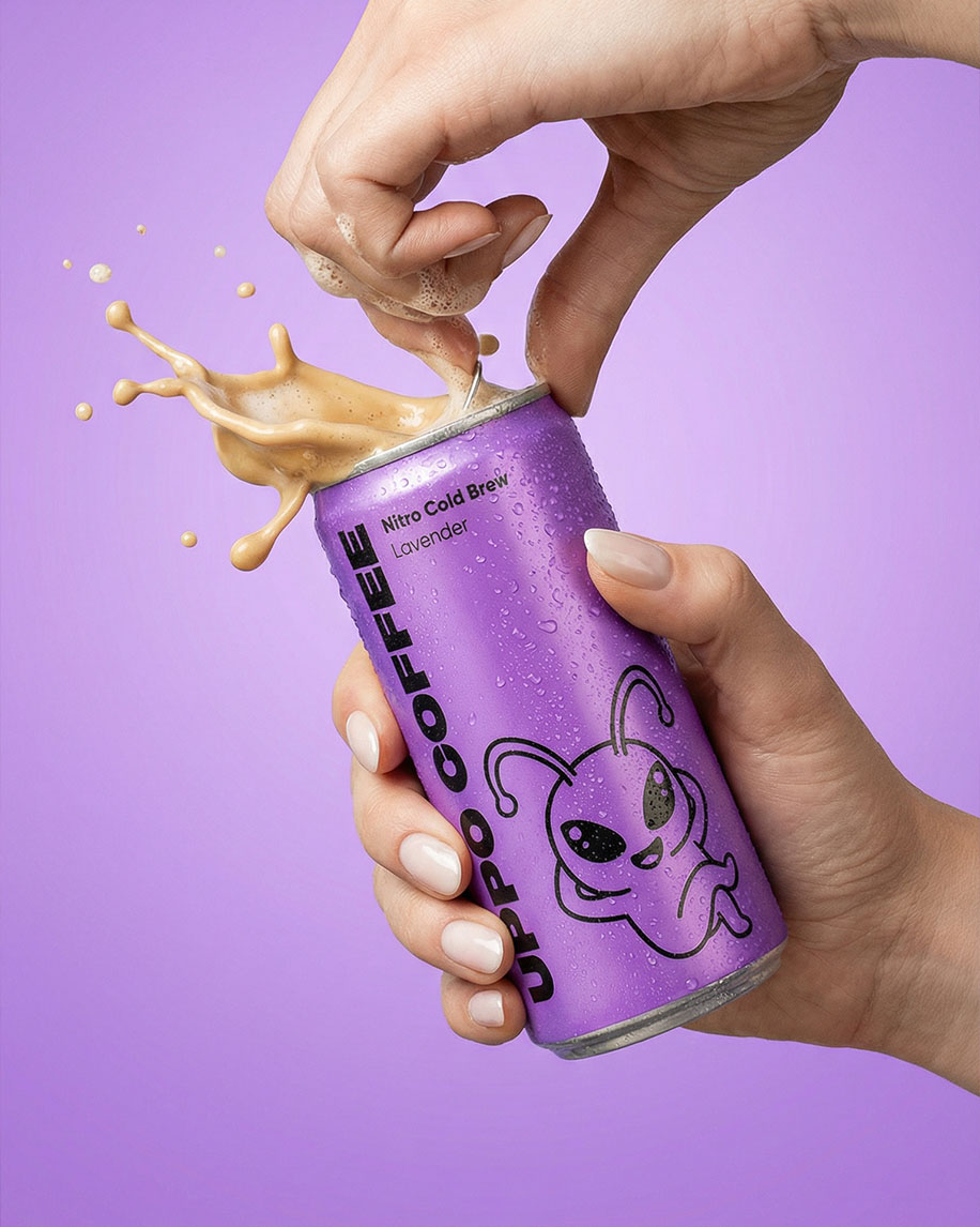
The project's entire visual content is built on the "here and now" aesthetic. Juicy colors, dynamic splash shots, and a raw, energetic presentation emphasize that UPPO COFFEE is made for movement. It’s a drink for those surfing the urban jungle, creating content, and always hunting for a fresh spark of inspiration. We made a product you don't just drink — you tag it in your stories because it looks just as cool as it tastes.
Meet UPPO — the chief ambassador of energy and the face of the brand. We created more than just a label graphic; we built a living character with his own charisma that became the core of all brand communication. Our team developed dozens of angles and scenarios so that our alien could organically interact with every flavor and content format.
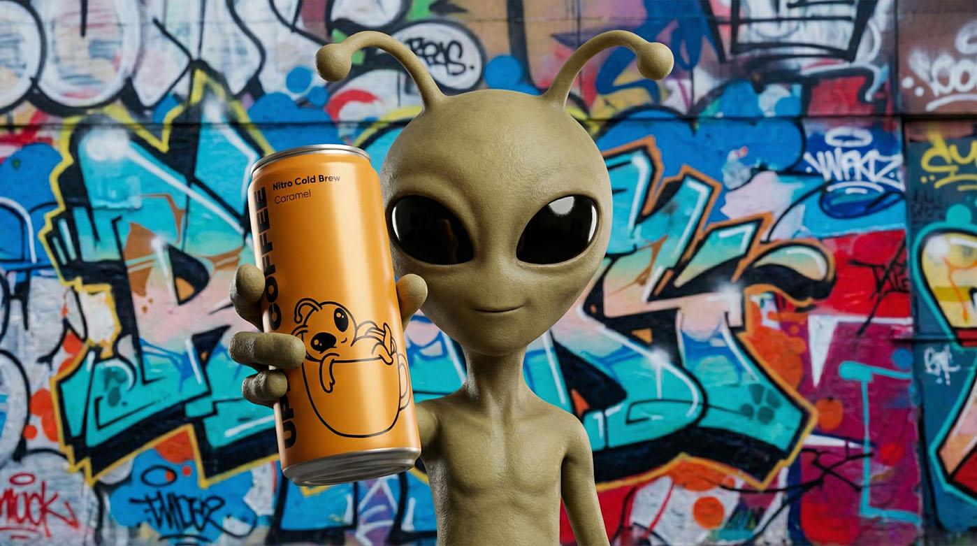
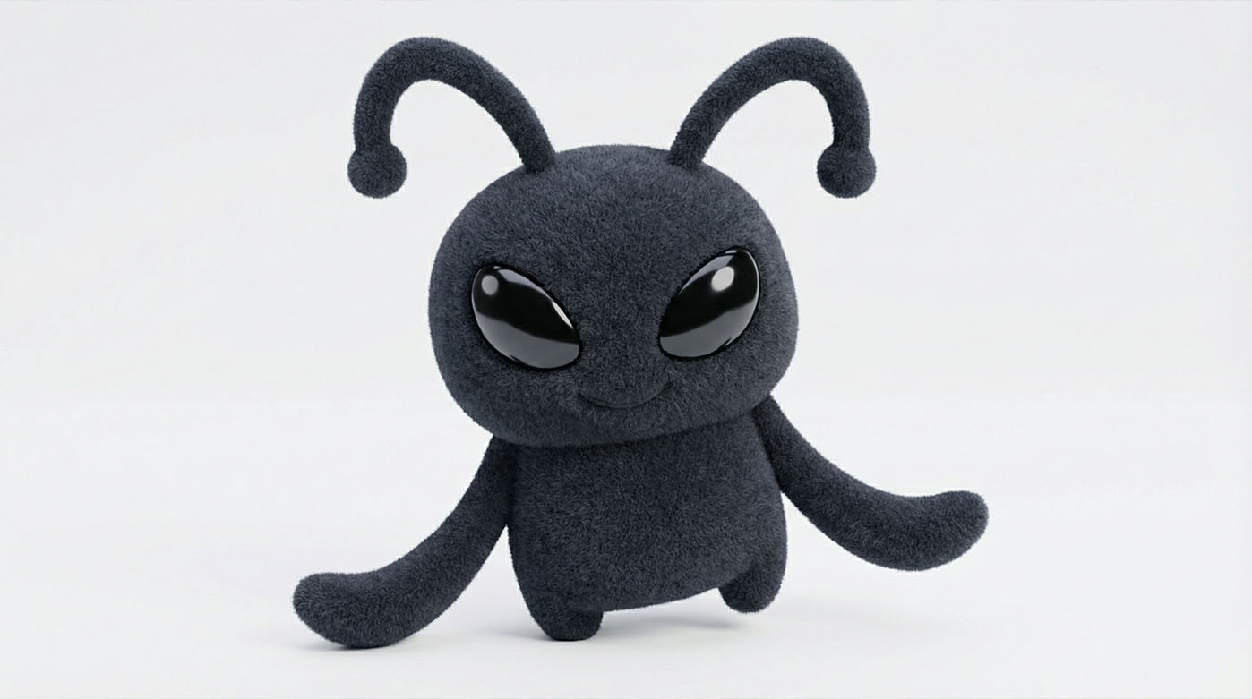
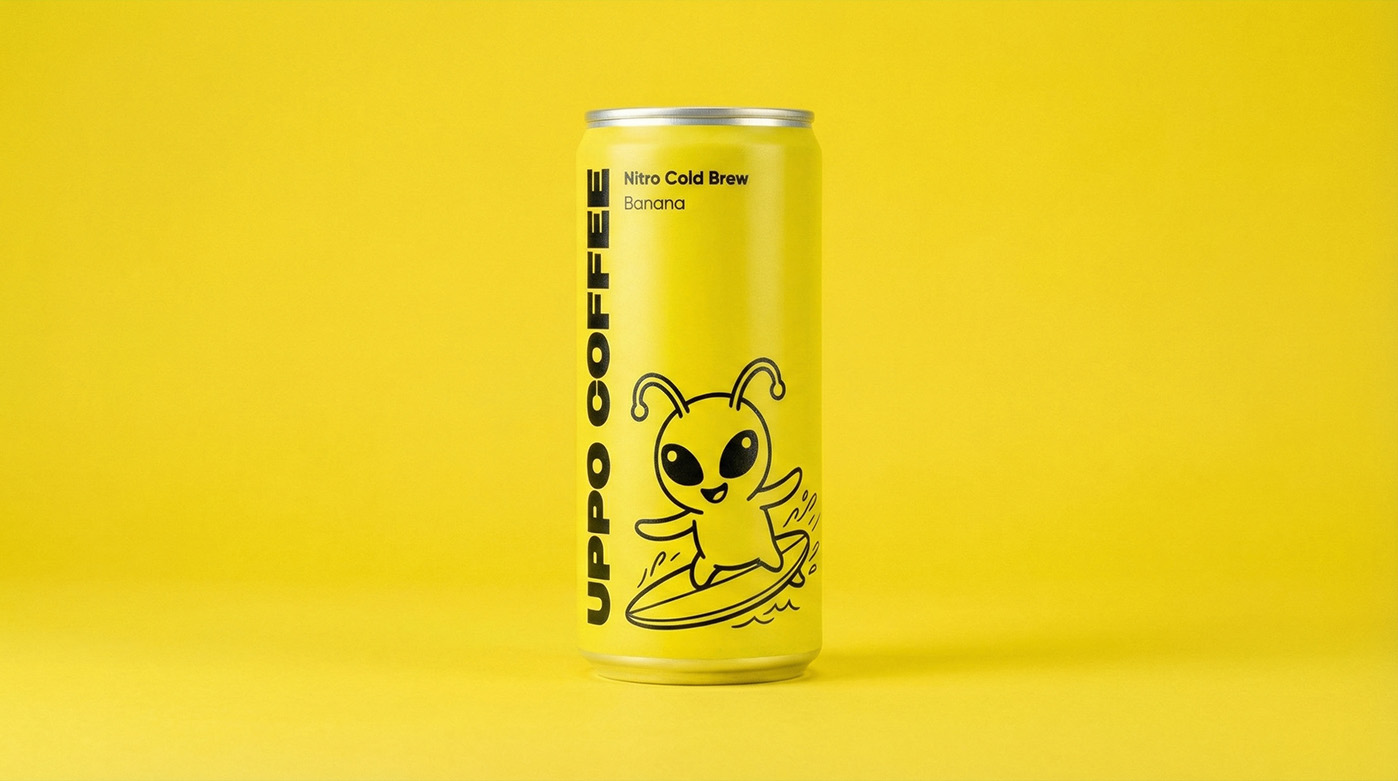
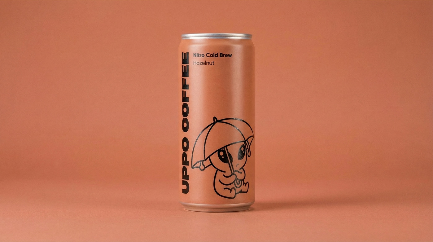
The work on the mascot started with finding a shape that was simultaneously weird and cute. We landed on an alien with big antenna-eyes radiating pure energy. To keep the character fresh and dynamic, we rendered a massive library of his "states": UPPO surfing, chilling in a coffee cup, hiding from the rain, or just winking at the customer.
The multi-angle approach allows us to easily adapt the brand to any need: from a tiny app icon to massive 3D figures in retail. We meticulously crafted facial expressions and gestures to communicate the core message through the mascot — Nitro Cold Brew from UPPO COFFEE is always about fun and breaking boundaries. This approach makes the identity flexible, recognizable, and truly relatable to a younger audience.
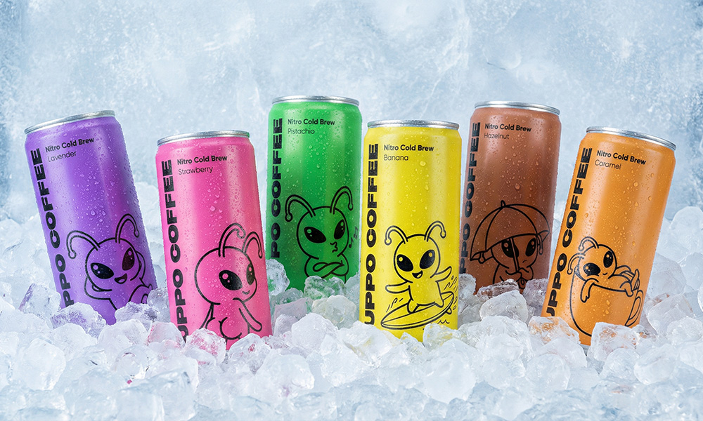
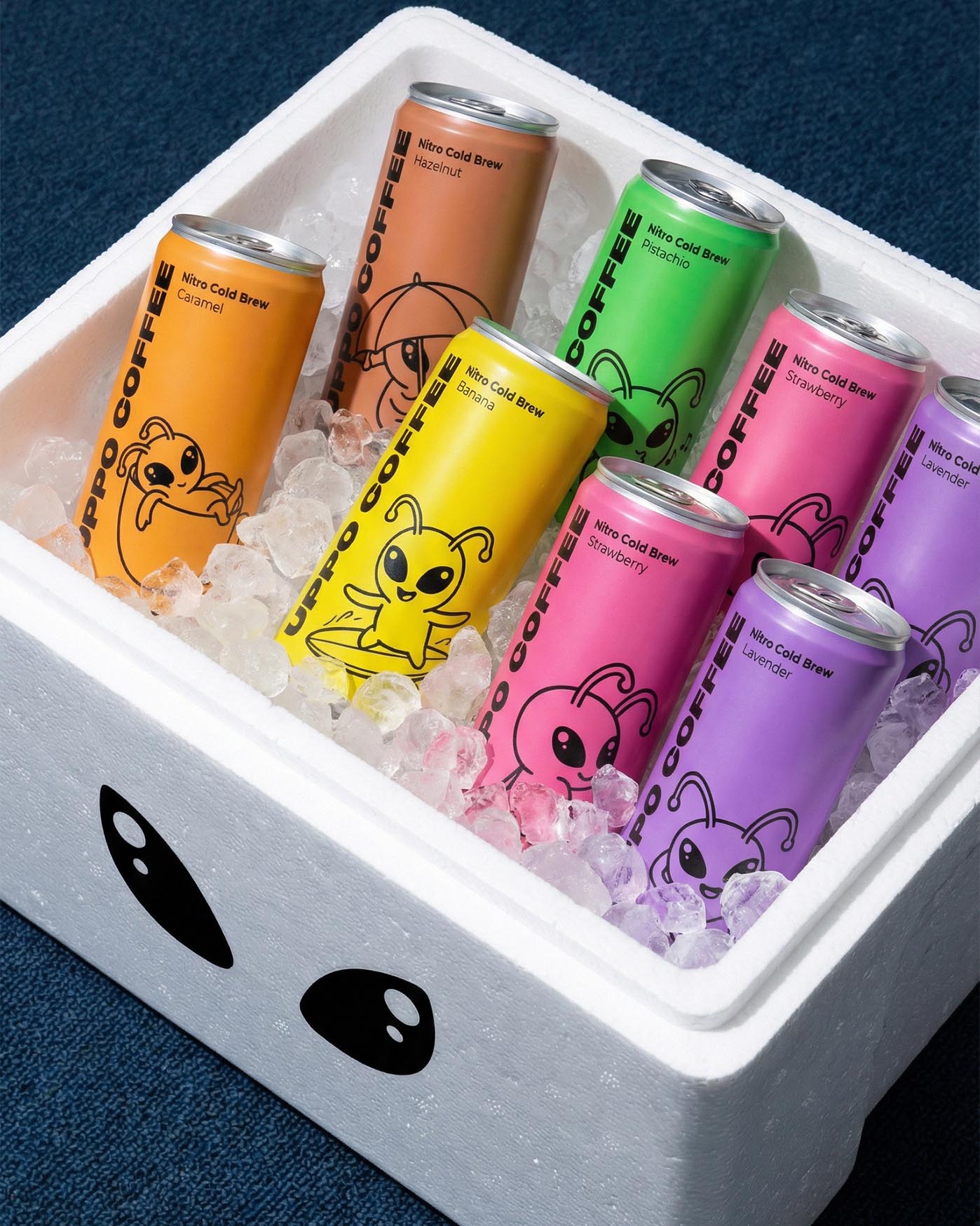
Every UPPO COFFEE can is a separate universe where color and illustration tell the story of the drink's character. We developed a flavor identity system that helps consumers instantly read the product's mood. It is a vibrant chaos organized by thoughtful design, where Nitro Cold Brew coffee becomes a part of pop culture.
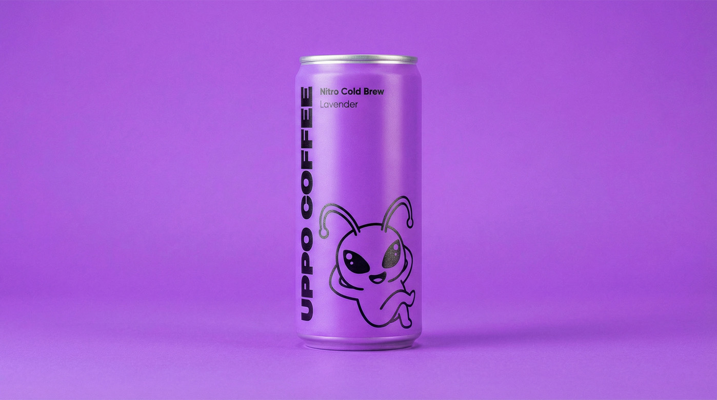
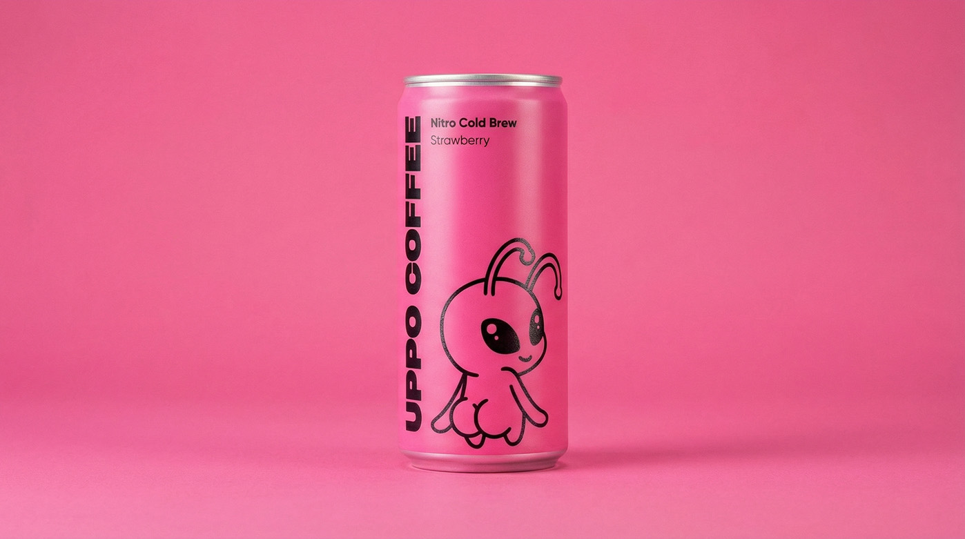
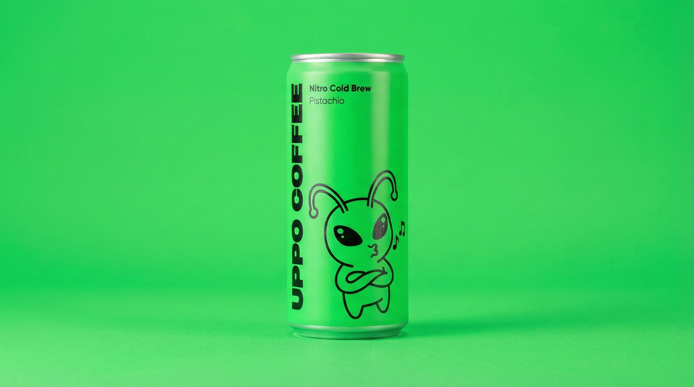
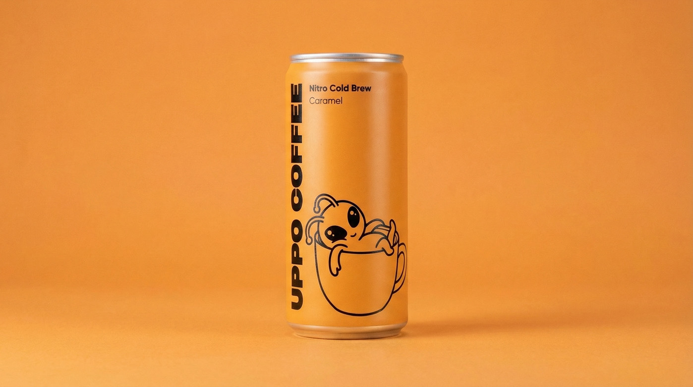
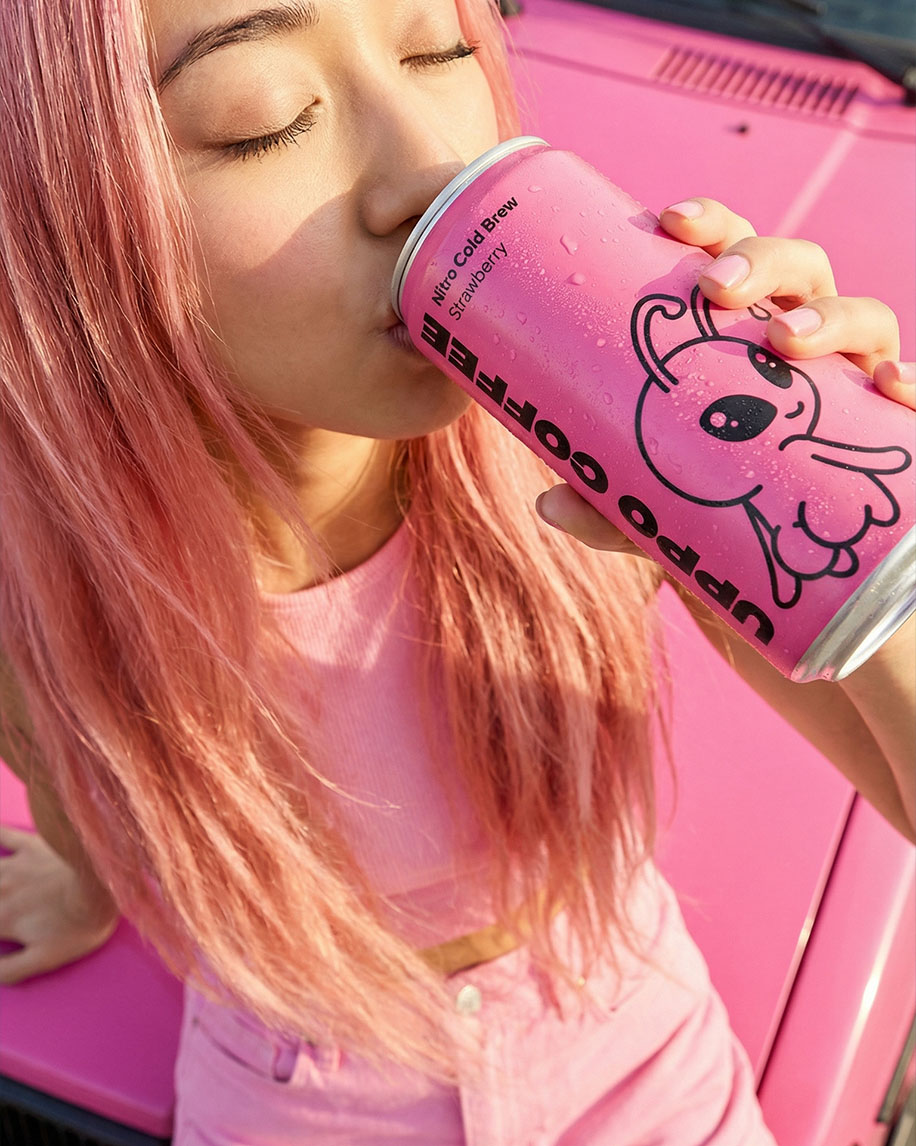
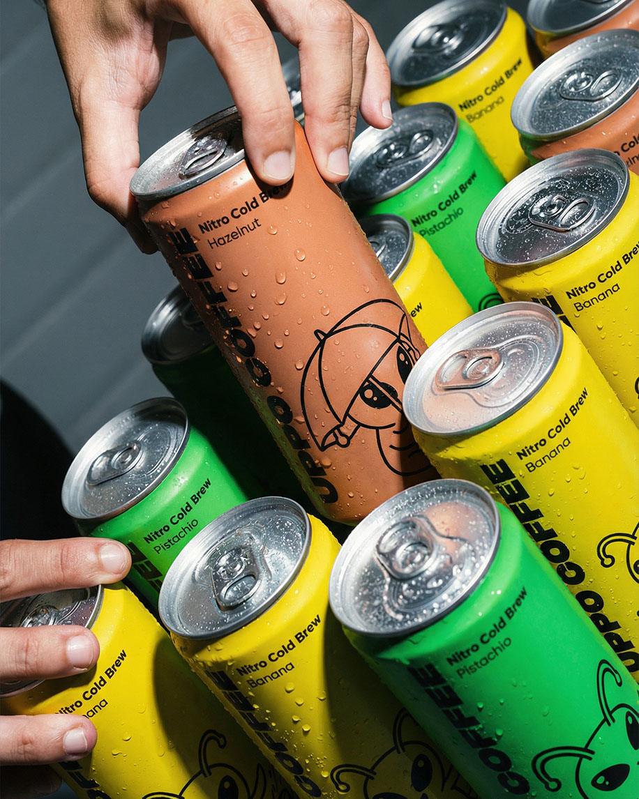
We ditched classic coffee coding in favor of a bold palette that triggers direct taste associations. We chose deep green for pistachio, juicy orange for caramel, and a lavender shade that perfectly highlights the drink's floral notes. Each color acts as a visual trigger, making the can stand out from competitors on the shelf.
The UPPO mascot adapts to each line, changing his activity: he might be catching a wave or hiding under an umbrella. The matte texture of the cans, combined with the wet condensation effect in the photos, creates a feeling of true freshness. This design doesn't just sell coffee; it invites the customer to collect the entire alien flavor lineup.
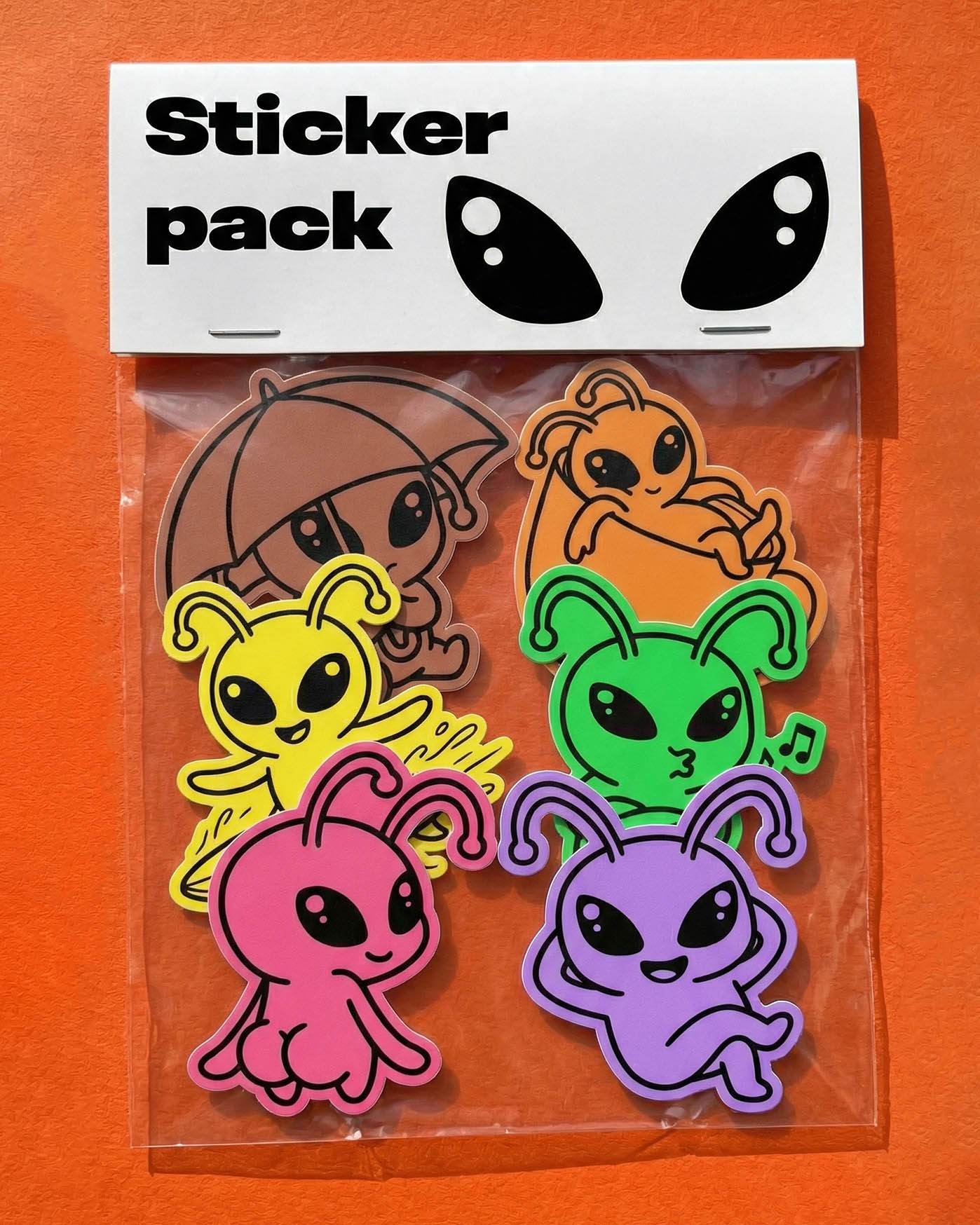
We extended the visual language of UPPO COFFEE beyond the can itself, creating a cohesive ecosystem. In branding the shipping boxes and stickers, we leaned into graphic simplicity. This allows the focus to shift to the most recognizable element — the large, alien eyes, which act as a powerful standalone visual code.
The shipping materials are designed with strict minimalism: a clean white background featuring only UPPO's gaze to greet the customer. This contrast between the understated outer box and the "explosive", vibrant content inside creates a killer unboxing effect. It gives the brand a premium feel and shows that every detail — from logistics to the retail shelf — has been carefully considered.
The sticker pack serves as a natural extension where we brought back the line's juicy colors. We maintained the character-flavor link: pink for strawberry, green for pistachio, and so on. Each sticker replicates the mascot's unique poses, allowing fans to customize their gear and take the UPPO vibe offline. This approach transforms standard merch into a tool for viral marketing and emotional brand connection.