To design a catalog that highlights the brand’s technological character, international level, and premium presentation. The design had to convey precision, reliability, and the company’s modern identity.
For Tamam, we designed a catalog that brought together the brand’s scale, technical expertise, and premium presentation within one clear visual system. The goal was to create something that felt not only informative, but also strong enough to instantly communicate the company’s level.

In this project, we focused on the catalog as the brand’s main presentation piece. For a company operating at this level, such material cannot feel like a simple collection of technical pages. It needs to shape the first impression, build trust, and present the brand as a confident and established player in its field.
That is why the design is built around a restrained, dark, and visually premium style. This approach highlights the company’s engineering nature, adds a sense of solidity, and helps organize a large amount of content in a clean and structured way. Strong typography, a clear page system, and a balanced visual rhythm create a feeling of precision, order, and professionalism.
We also paid close attention to how the catalog works as a whole. It was important that it would not feel fragmented from spread to spread, but rather read as one complete product. Because of that, the visual system was developed so that every page supports the overall style, while the entire presentation feels consistent, confident, and modern.
As a result, the catalog became more than just an informational item. It turned into a part of Tamam’s image, helping present the company at the right level and visually emphasizing its international scale, technical strength, and serious approach to its work.
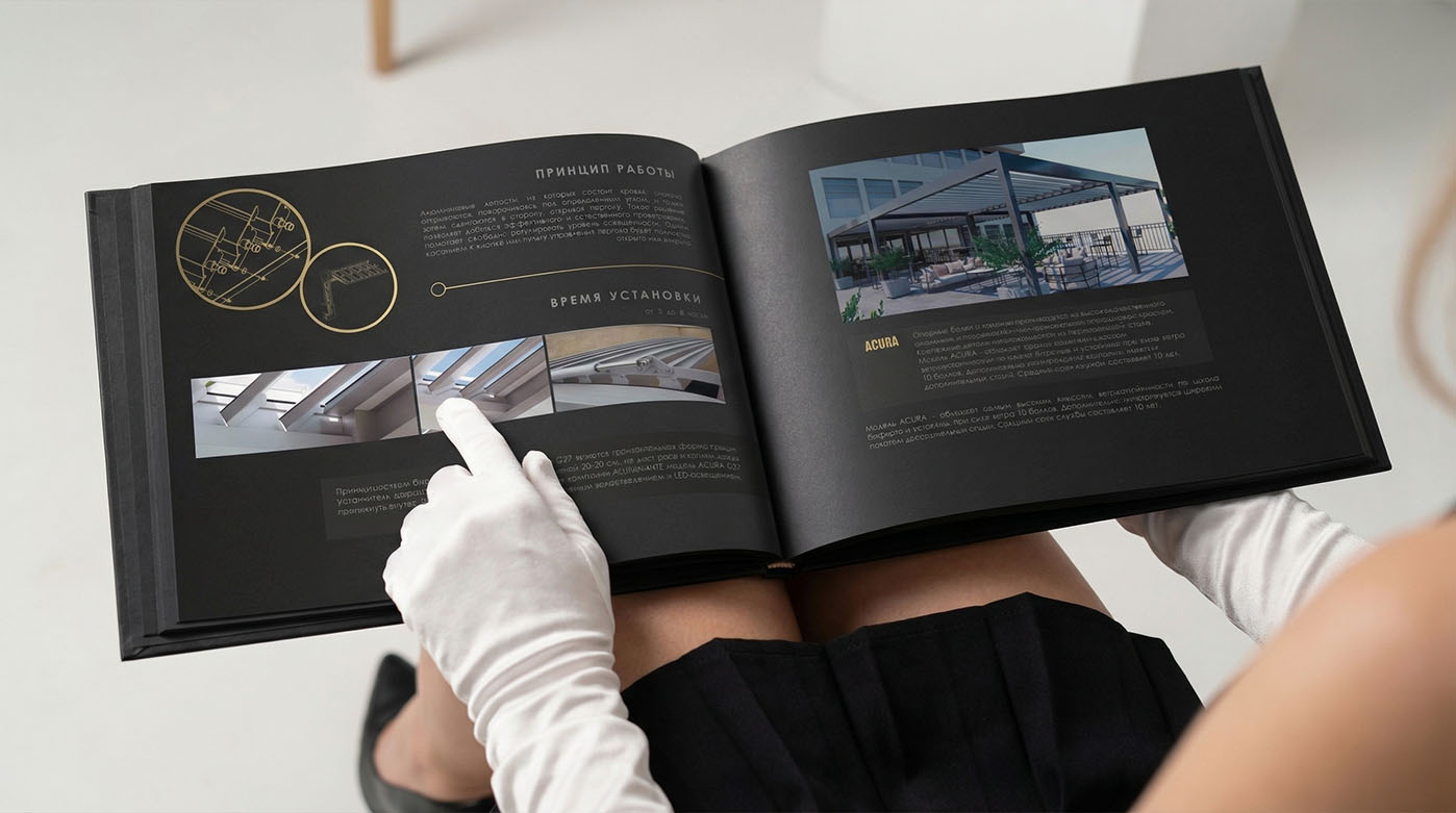
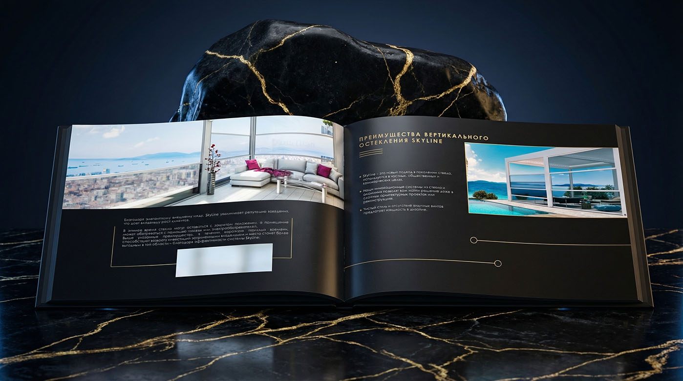
This block shows part of the page work behind the catalog, focused on presenting the product line through clear visual hierarchy, structured content, and an overall premium feel.
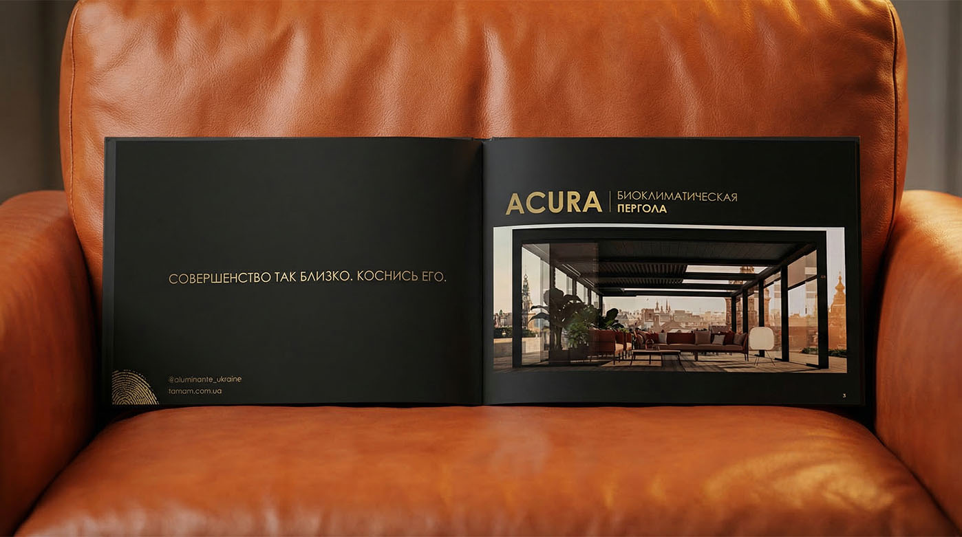
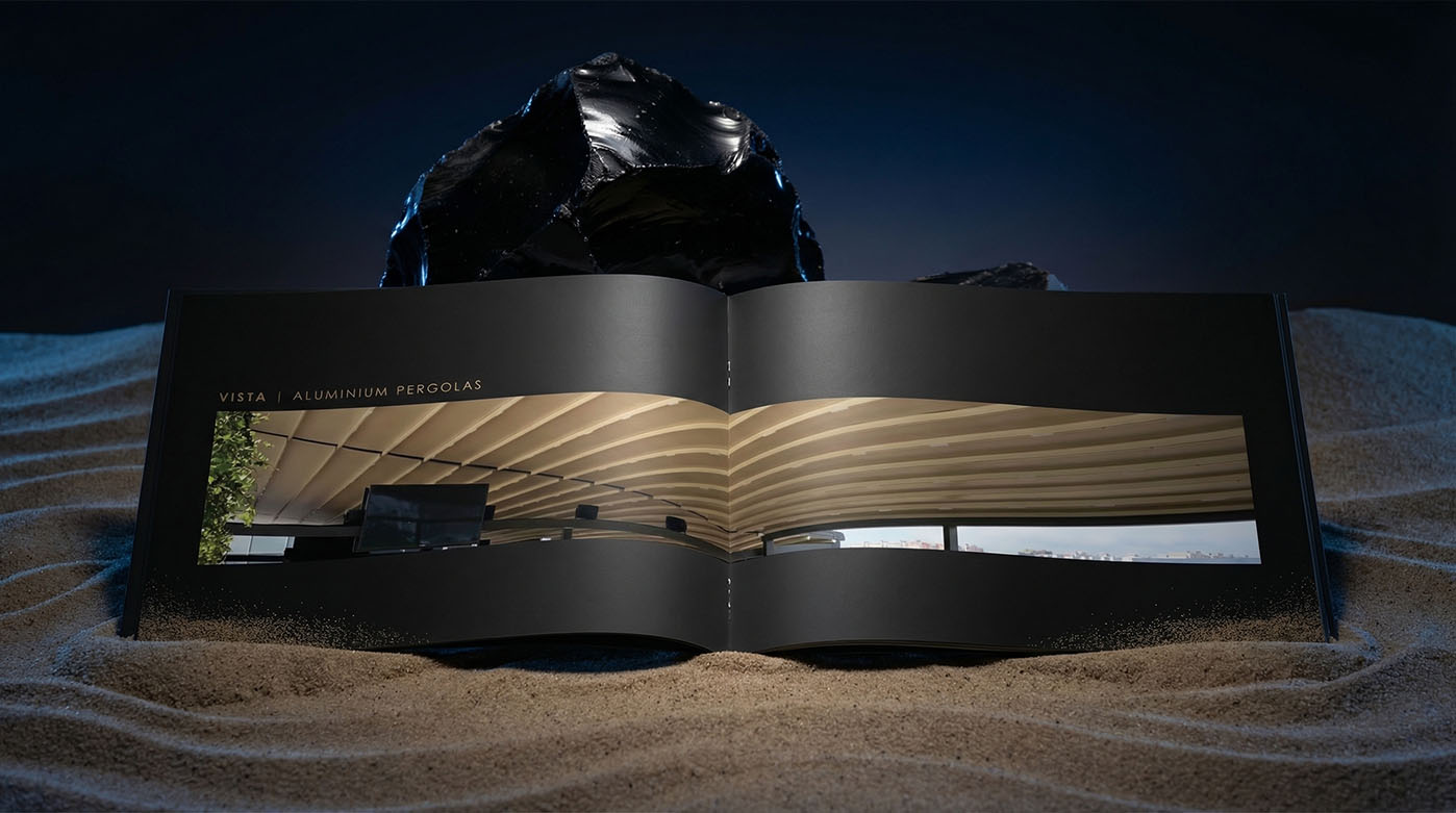
The catalog required deep work with the product itself and with the logic of how it should be presented. It was not just about placing images and text on the page, but about building each spread in a way that felt confident, cohesive, and visually convincing.
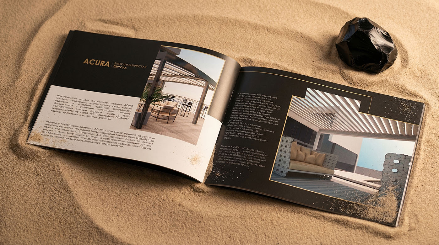
We carefully developed the composition of the pages, the balance between text and imagery, the rhythm of visual accents, and the overall clarity of the layout. Special attention was given to making the catalog feel premium and modern while still staying easy to read. This level of detailed work with the content became the foundation of the entire project.
In the final result, the catalog grew into a large multi-page presentation piece where every spread contributes to the overall impression, and the whole system feels cohesive, confident, and well-structured.
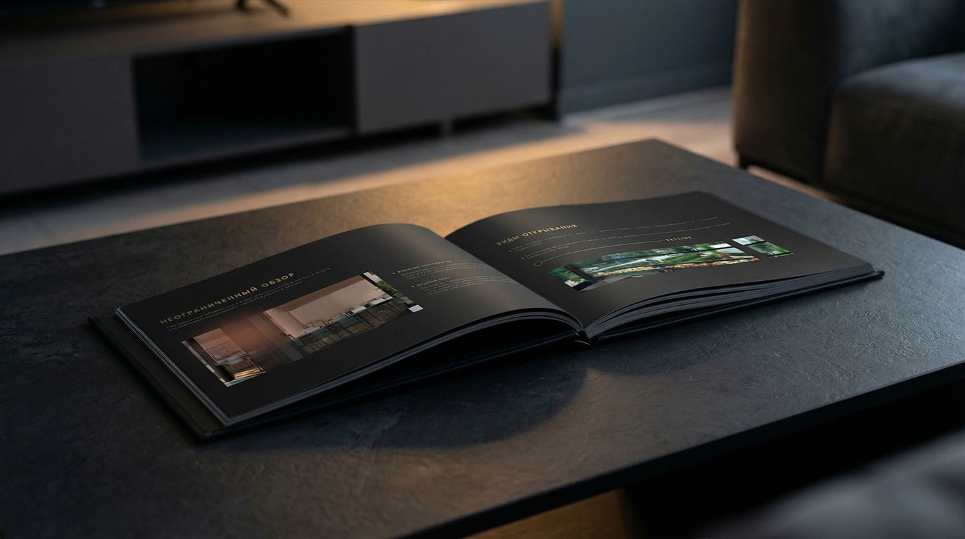

As the project developed, the catalog gradually became a large presentation tool with 100+ pages. This made it possible not only to showcase the product line in detail, but also to build a full visual story around the brand, where each spread supports the overall character of the project.
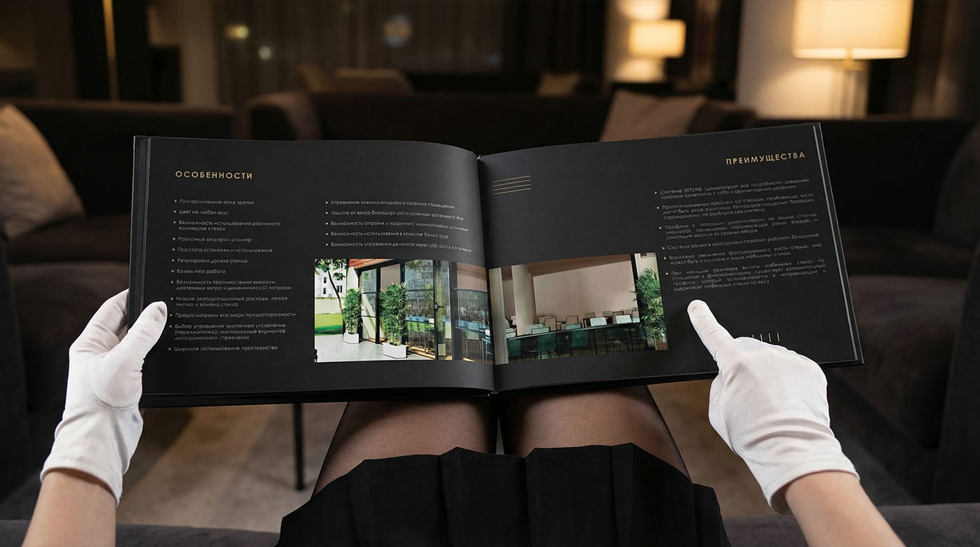
It was important for us to maintain a strong sense of consistency throughout the entire catalog. When working with this kind of volume, the real challenge is to balance variety in presentation with a unified visual language. That is why we paid close attention to the rhythm of the pages, the placement of accents, the density of information, and the overall visual pacing.
The result is a catalog that feels complete as a product in itself. Large in scale, carefully developed, and visually strong, it became a full part of the brand presentation and helped bring the entire product line together into one clear and premium system.