Karst: geometry meets sharpness
Overview
Karst is a versatile geometric sans-serif typeface designed by Mirela Belova and Stan Partalev at Type Forward. It is built on simple, precise forms: rounded elements transition smoothly into straight lines, while sharp angles add a sense of dynamism.
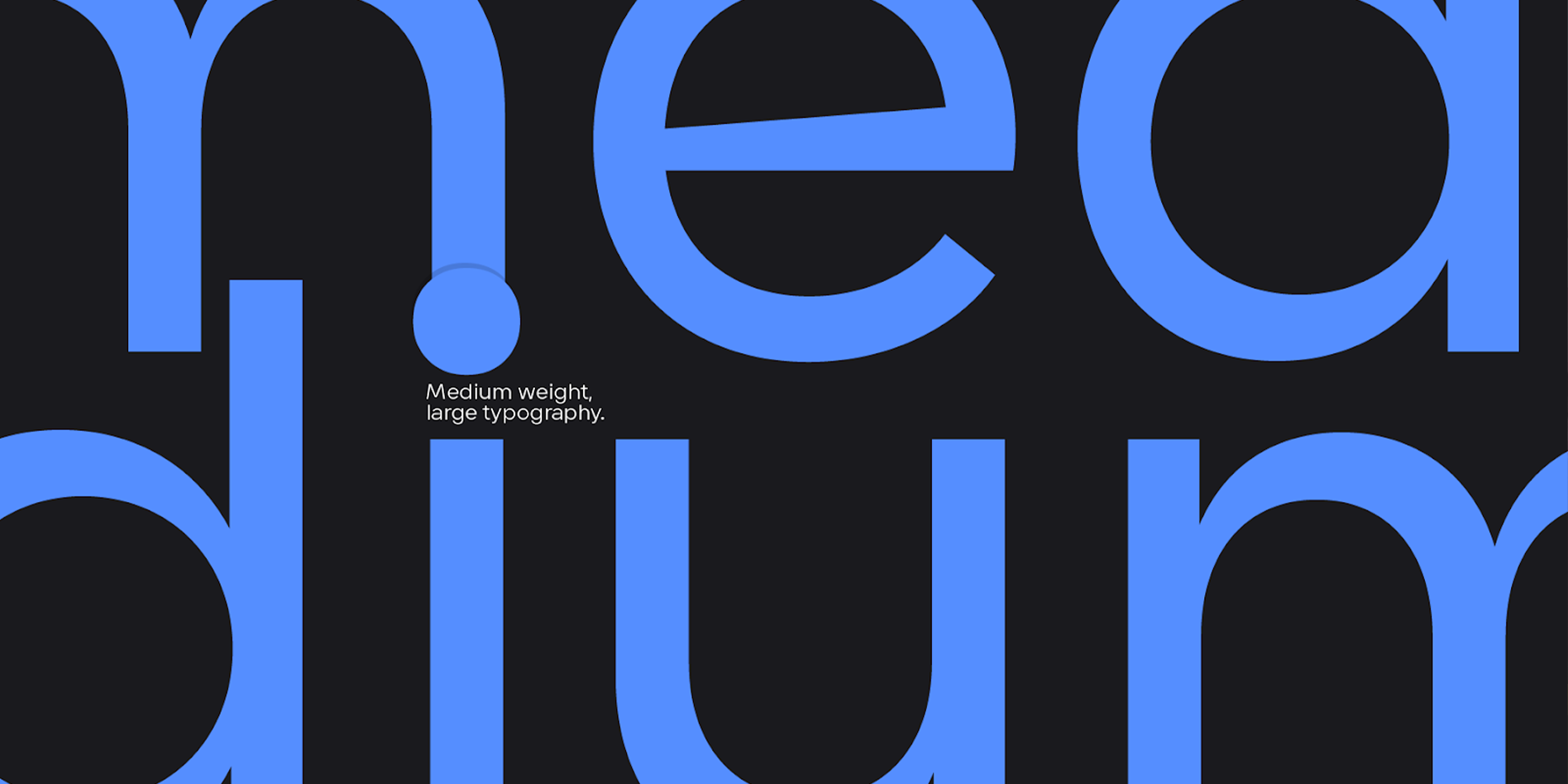
Its tall x-height ensures strong legibility even at small sizes, while open letterforms (such as “c” and “e”) prevent the text from feeling cramped. The minimal contrast between vertical and horizontal strokes creates a harmonious, well-balanced texture.
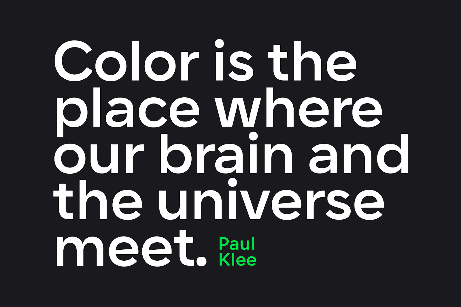
Thanks to this combination, Karst works equally well for striking headlines and extended passages of text, maintaining visual coherence while adding character to every word.
Inspired by Landscapes
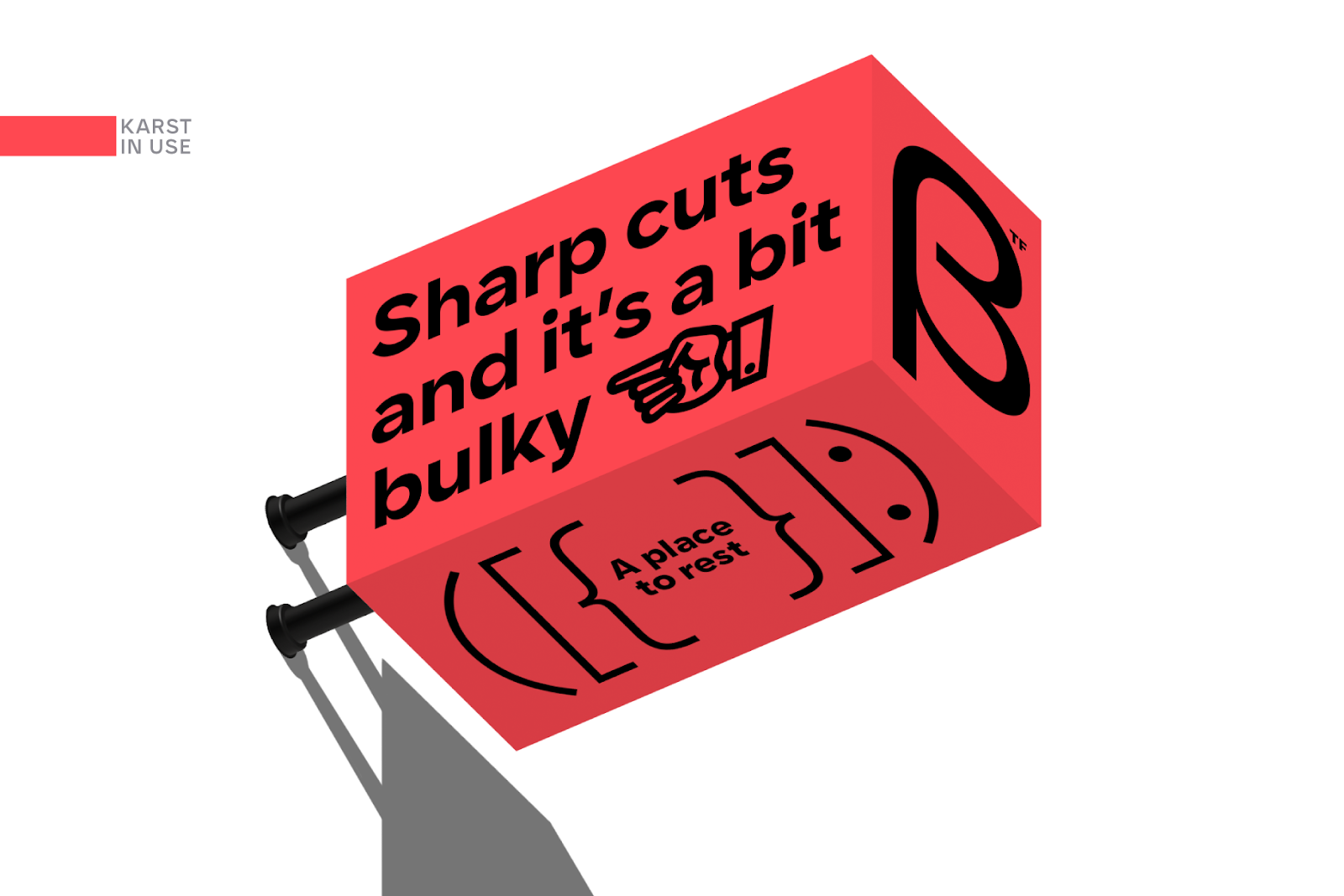
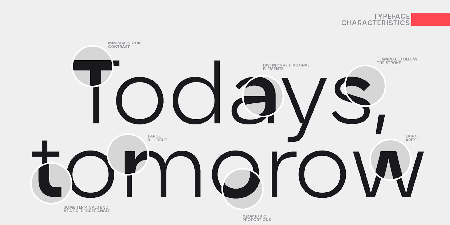
The name of the typeface directly references karst landscapes — geological formations shaped by caves, limestone outcrops, and underground rivers, where smooth surfaces are repeatedly interrupted by sharp fractures. This very contrast between “flowing curves” and “jagged edges” is reflected in the details of the design.
Look at the letters “A,” “V,” “M,” “K,” and “Y”: their diagonal cuts add a sense of precision, while the horizontal strokes in “e” and “a” feature a subtle angular tilt. These small details make Karst feel both geometric and alive, echoing natural forms in an organic way.
A Broad Family of Styles
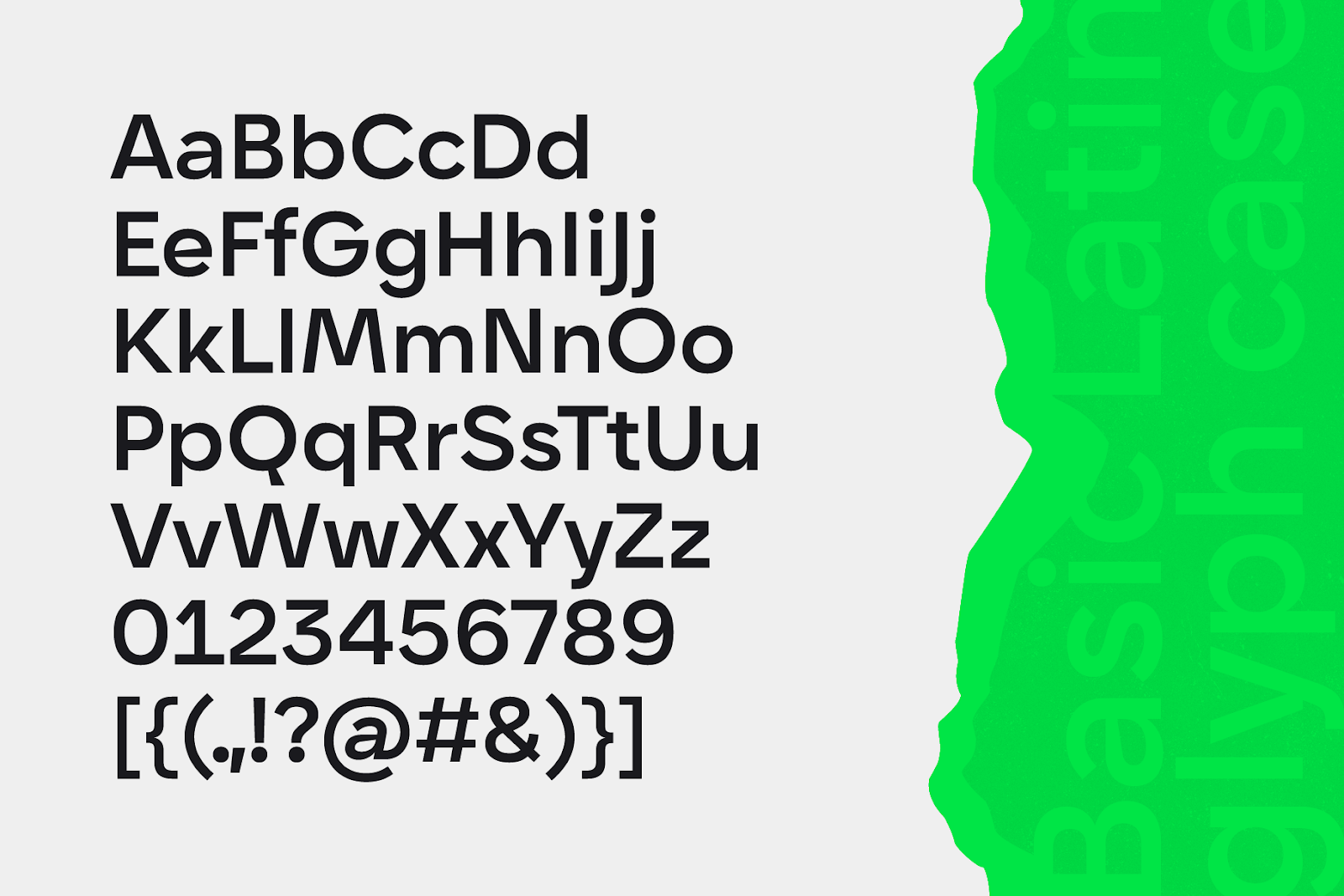
Karst comes as a complete family of 18 styles: nine weights — from the delicate Thin to the bold Black — along with their matching italics. This ensures you can always find the right contrast and text density for any design task.
In addition to the classic OTF/TTF formats, the typeface is also available as a web font and as a variable font with two control axes (weight and italic). This level of flexibility makes it ideal for responsive design, allowing designers to fine-tune the type for any interface or layout.
Functional Features
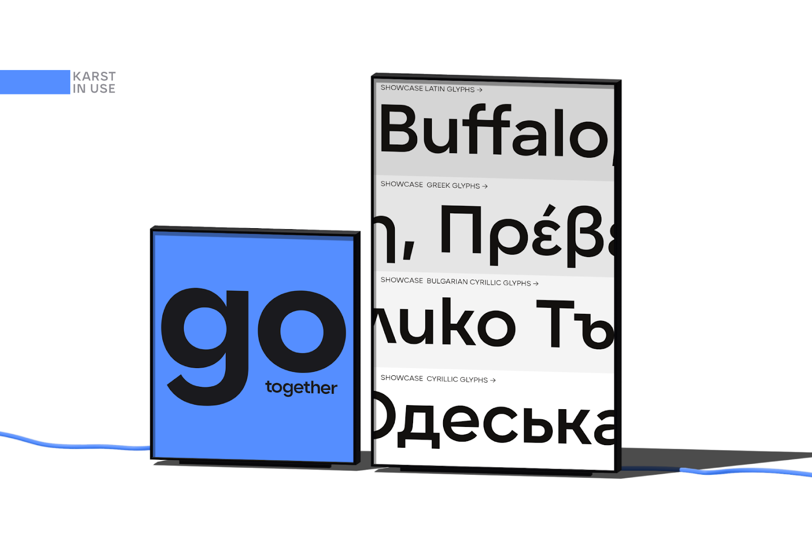
Karst includes an extended character set: support for Latin, Cyrillic, and Greek scripts makes the typeface usable in more than 220 languages. This makes it a practical choice for international projects and multicultural brands.
The font also implements a full range of OpenType features, including standard and discretionary ligatures, stylistic alternates (such as the forms of “a” and “g”), tabular figures, ordinal markers, and region-specific punctuation. Thanks to these capabilities, Karst is equally well suited for data-driven layouts and expressive graphic experimentation.
Why Karst?
Karst combines geometric clarity with distinctive, nature-inspired “sharp” details, making it both versatile and instantly recognizable. It is highly legible, scales beautifully, offers a powerful set of fine-tuning options, and suits everything from brand logos to long-form text.
At Artevide, we recommend Karst for those who value clean lines while seeking to add a contemporary yet “living” character to their projects. This typeface becomes a reliable tool for building distinctive and stylish design systems.