The client wanted to move away from standard beauty visuals and create something lighter and more atmospheric. The focus was on natural tones, a minimalist approach, and details that communicate calmness, care, and aesthetics. The identity had to work seamlessly across social media, printed materials, and product design.
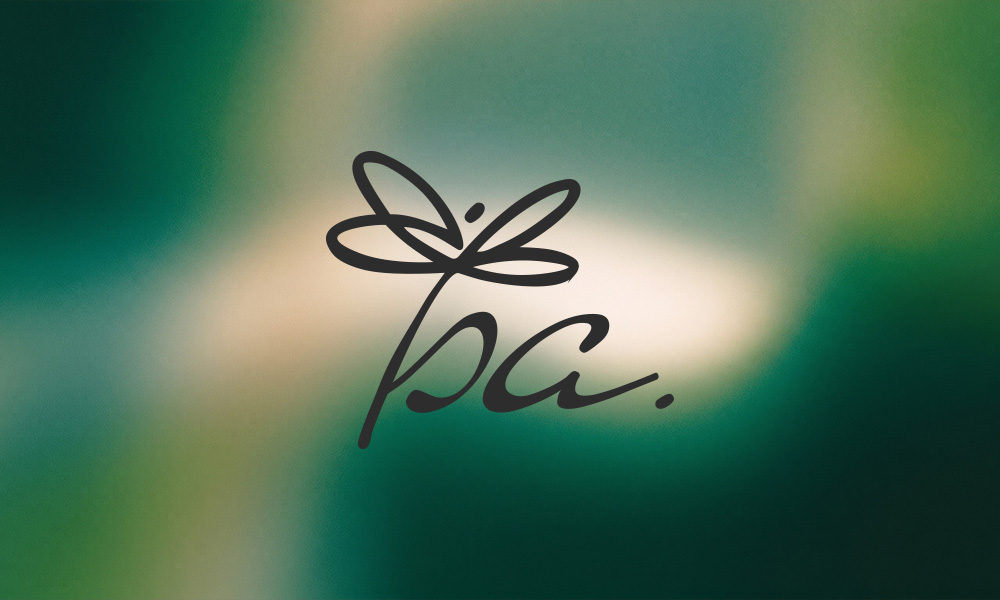
A minimalist logo inspired by natural forms, soft movement, and delicate beauty aesthetics.

The core of the identity became a custom symbol shaped as a stylized dragonfly. We wanted to move away from typical beauty visuals and create a mark that feels light, recognizable, and emotional without being overloaded with details.
The logo is built around smooth lines and soft curves that create a sense of calmness and natural flow. The dragonfly became the key visual element of the brand, associated with lightness, transformation, and organic aesthetics.
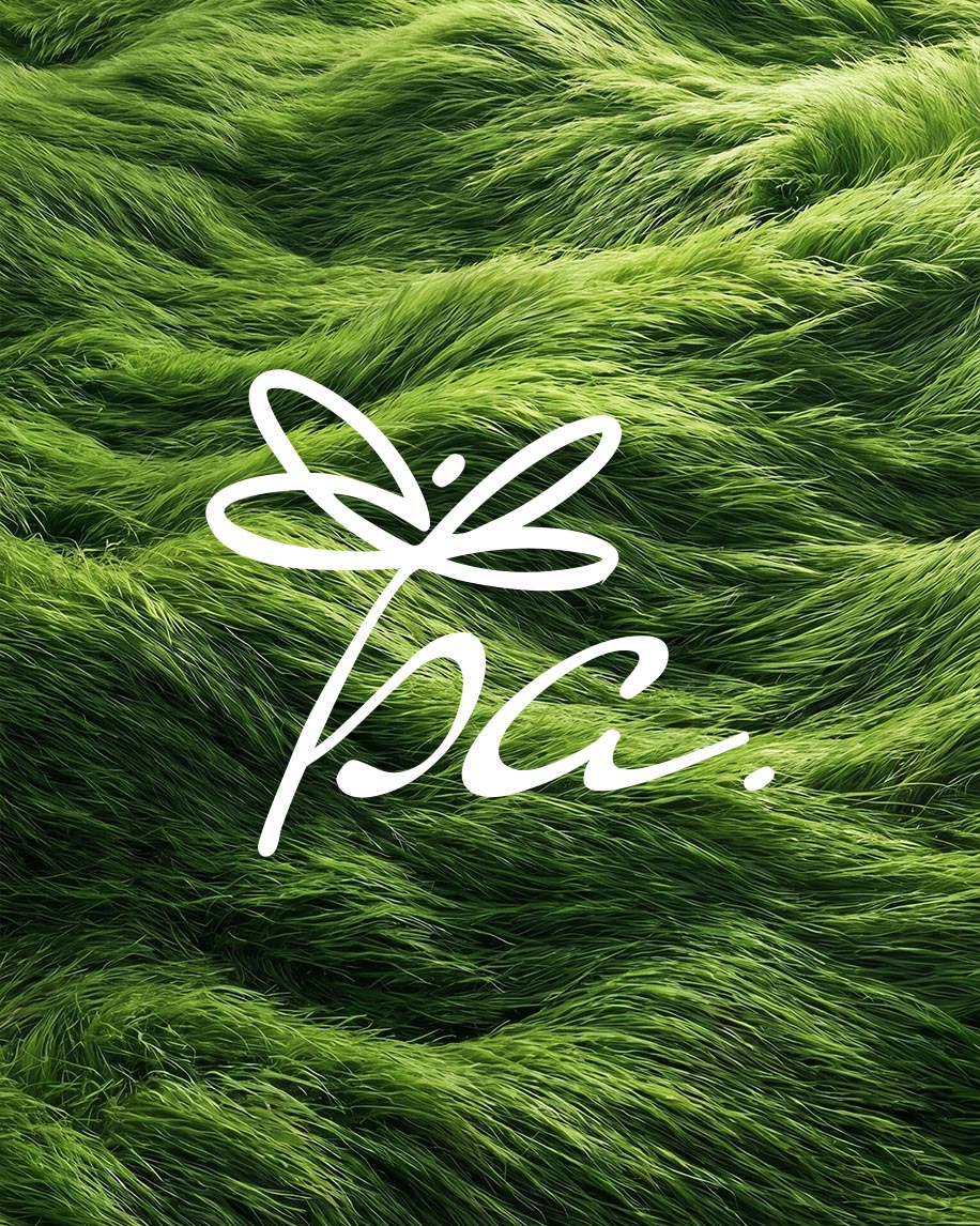
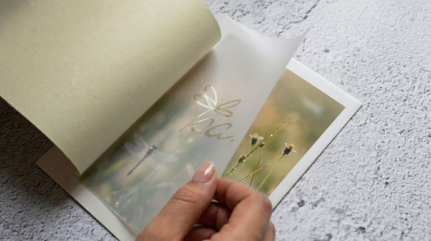
The visual system is supported by natural textures, soft tones, and atmospheric photography filled with light, movement, and subtle blur. This approach made the identity feel more alive and emotional while maintaining a clean minimalist style.
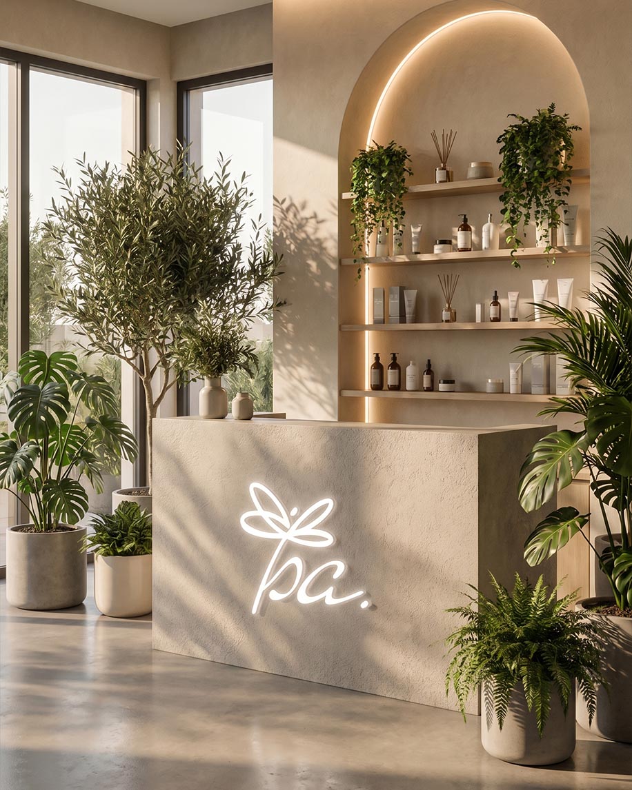
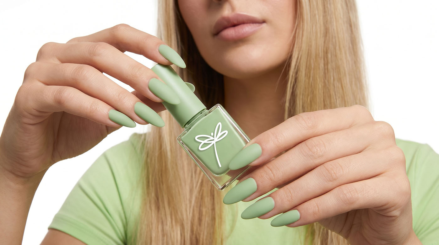
The logo works consistently across both digital and physical applications, from studio signage to printed materials and beauty products.
A soft and natural visual system built around textures, light, and subtle details.
The ISA identity was designed as a complete atmosphere rather than just a set of branded materials. The goal was to create a feeling of calmness, lightness, and natural aesthetics through colors, materials, composition, and visual accents. Minimalism remained at the core of the identity, but without the cold and overly sterile look often seen in the beauty industry.
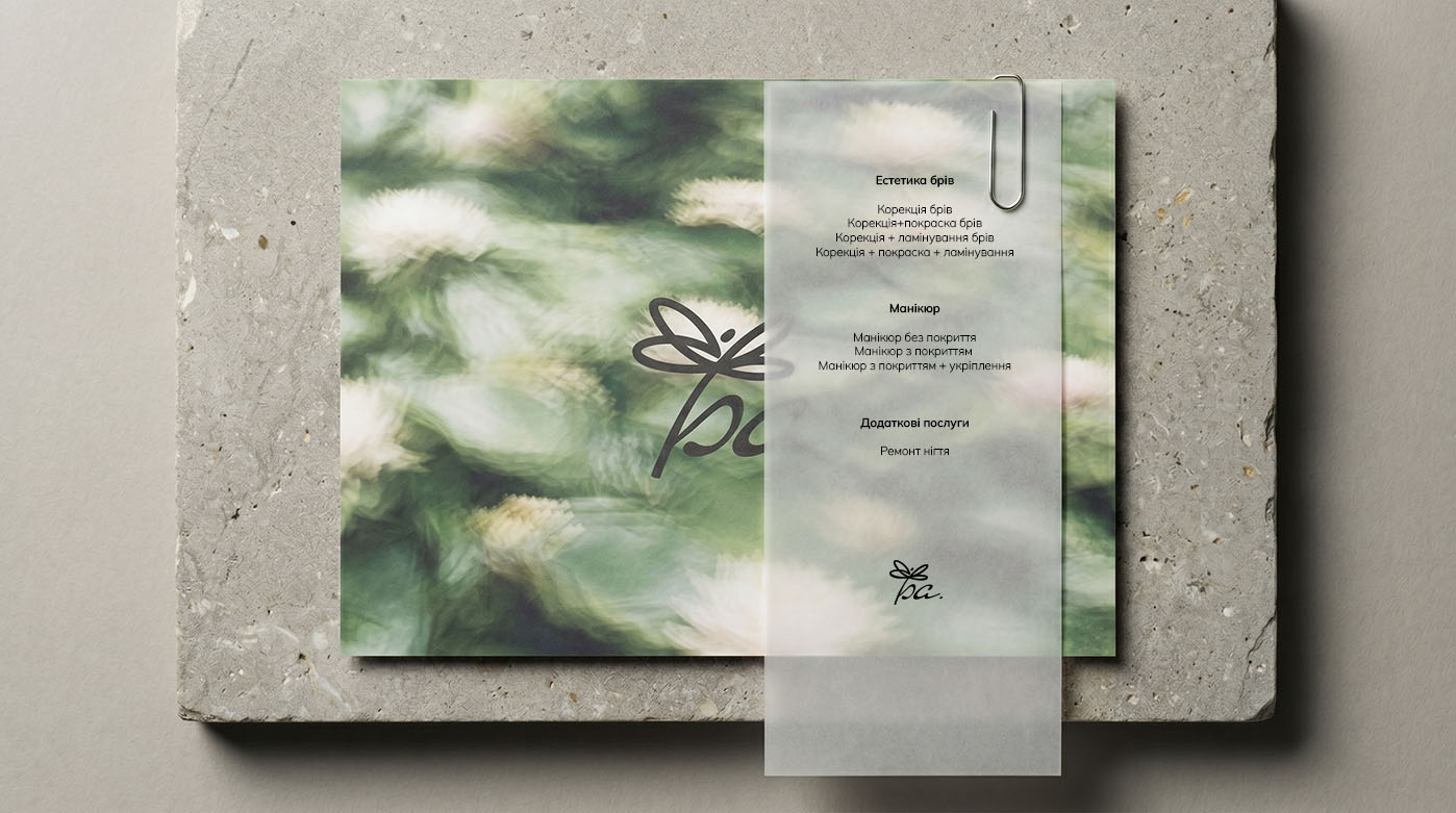
The visual system is based on natural green tones, soft textures, translucent materials, and spacious compositions.
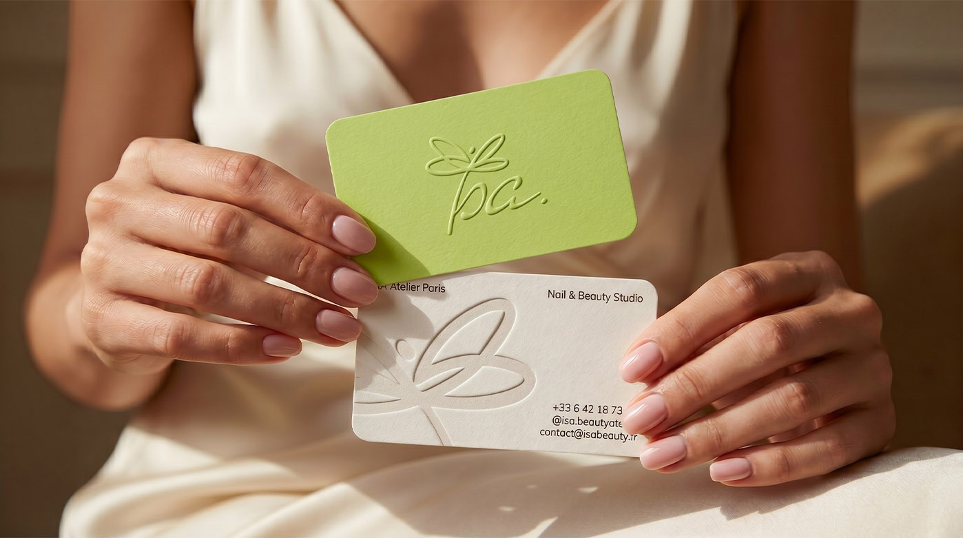
We adapted the identity for multiple applications including business cards, service menus, beauty products, and branded materials. Thanks to the minimalist approach and clean layouts, each element feels refined, premium, and recognizable.
Special attention was given to details such as embossing, semi-transparent surfaces, matte textures, and soft natural lighting. These small elements shape the overall brand perception and make the identity feel more tactile and alive.