To create a visual language that delicately communicates the sensitive topic of orphanhood while avoiding excessive drama. The identity needed to evoke unconditional trust at first glance, broadcasting warmth, sincerity, and German reliability. Our goal was to develop an image that is attractive to European donors yet friendly to children.
HelpWay is more than financial aid. It is an organization building an ecosystem for a happy future: from providing housing and education to deep psychological rehabilitation and socialization.
The foundation's mission is to replace the feeling of loneliness with the feeling of family. The project unites caring people around the idea that every child deserves a safe start in life. Therefore, our task was to move away from the image of a "strict bureaucratic institution."
The visual part had to reflect a warm, open community where support prevails. We aimed to create a design that speaks of hope and perspective, showing that HelpWay is a reliable bridge (Way) to a better life, which the child crosses not alone, but with support (Help).
The brand name became its main manifesto: HelpWay is the path of aid we pave for every child. The visual mark complements this idea, creating an image of safety and continuous support. It is a logo that needs no complex decoding — it is read with the heart.
The naming HelpWay is built on the fusion of two fundamental concepts: "Help" (action, support) and "Way" (path, direction, future). This name is easily understood in any country, which is critical for an international foundation. It broadcasts a simple truth: we don't just provide resources; we show the way to a new life.
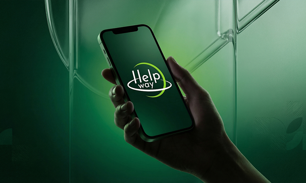
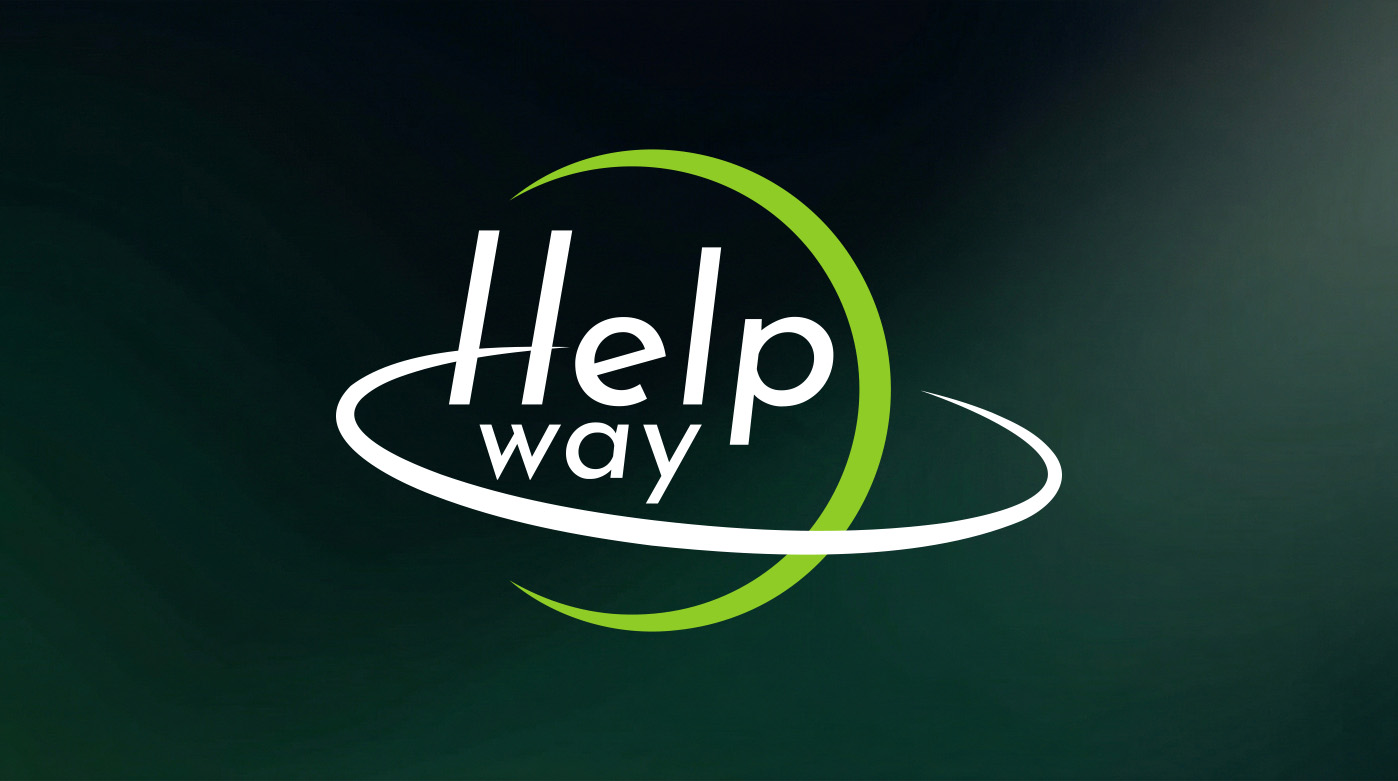
The graphic mark embodies the idea of an "orbit of care." The composition is based on dynamic arcs that encircle the name, creating the effect of a protective sphere or planetary orbit. This is a metaphor for a global community coming together around a child to shield them from external threats.
The logo's typography is a modern, clean sans-serif. The thin, elongated letters broadcast the foundation's transparency and openness, as well as German structure and order. The accent lime green color in the arc symbolizes life, the energy of growth, and a "green light" for a happy future, contrasting with the restrained white font. Together, these elements form the image of a brand that can be trusted with what matters most.
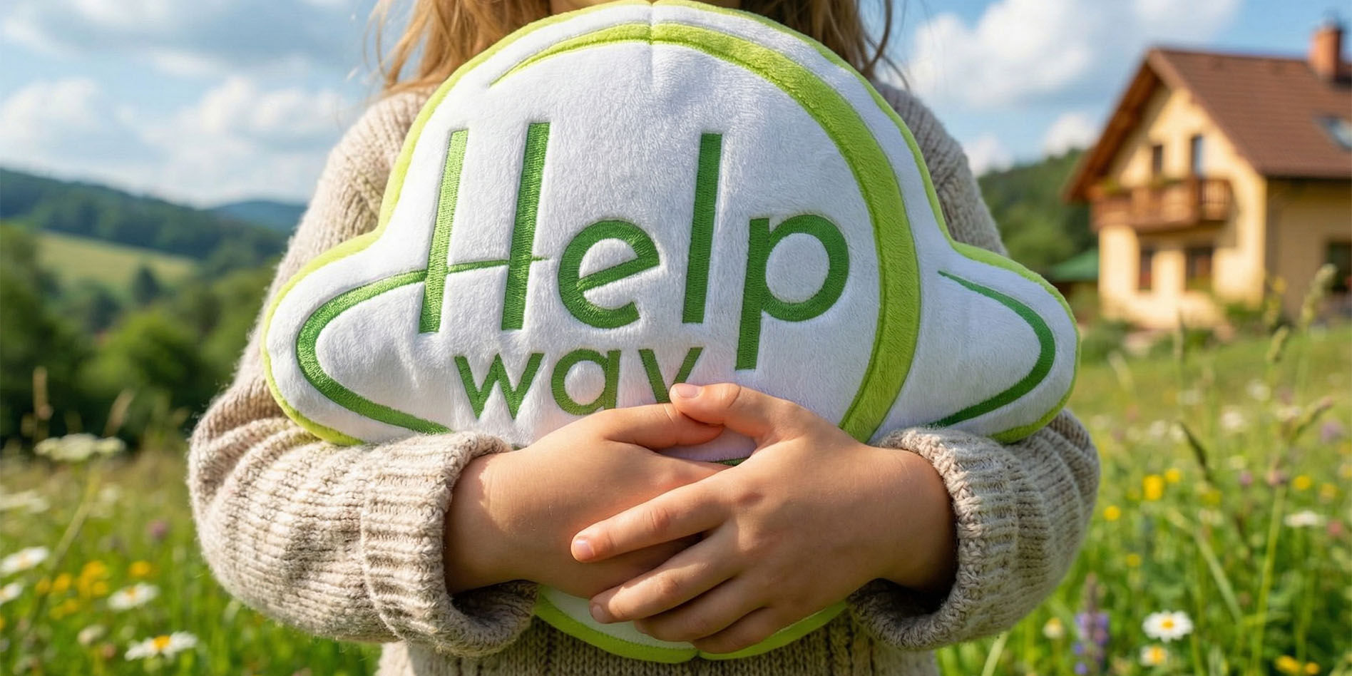
The HelpWay visual strategy extends beyond screens, coming to life in tactile objects that people actually want to wear and share. We developed a line of merchandise and accessories that communicate the foundation's values through empathetic design. Every element — from the hoodie embroidery to the vibrant stickers — aims to build a community of caring individuals united by a common goal.
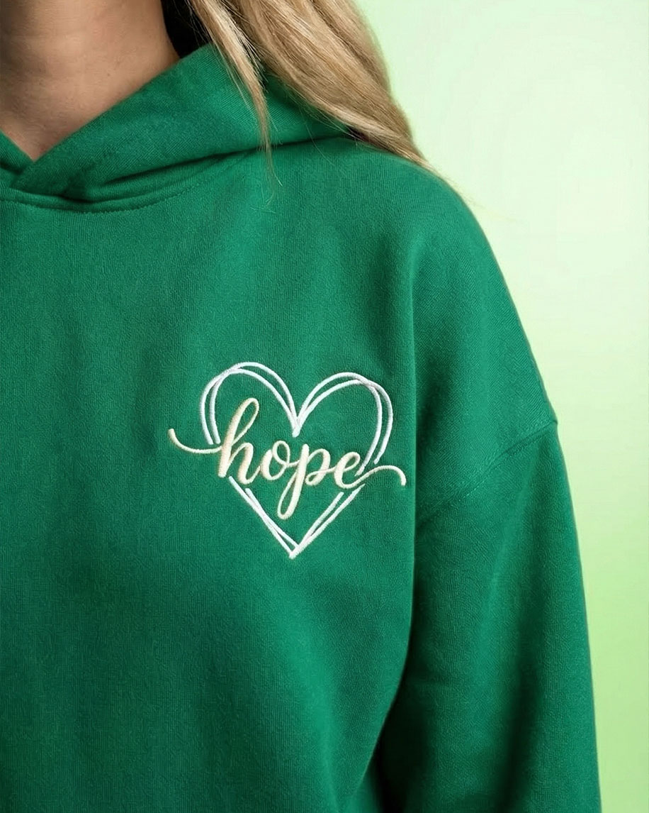
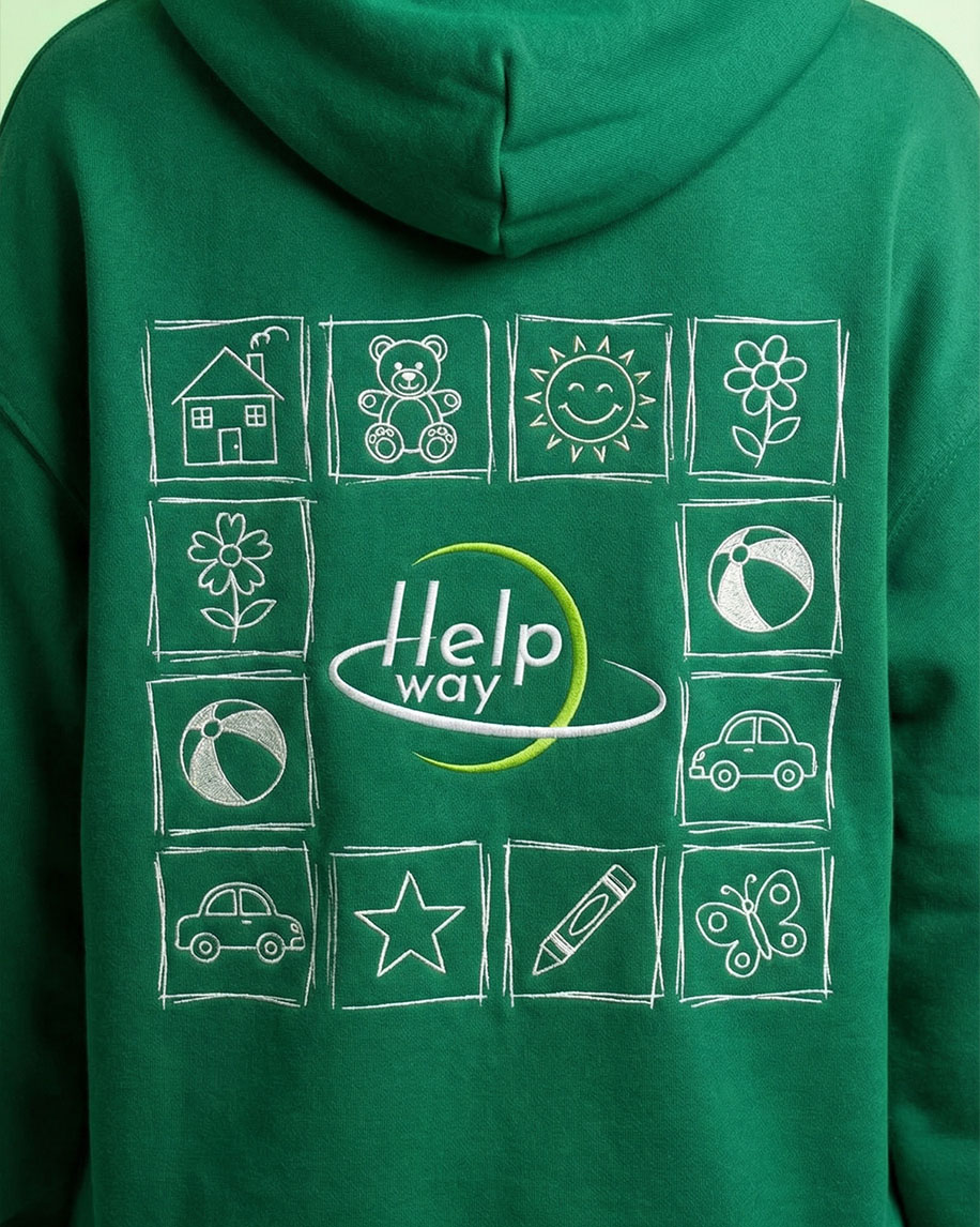
The centerpiece of the textile line is a hoodie in a deep green shade, symbolizing hope and tranquility. On the chest, a delicate "hope" embroidery is integrated into a heart outline — a subtle reminder that help starts with an inner spark. The back of the hoodie reveals the brand's story through a grid of naive illustrations. We intentionally used a hand-drawn style to emphasize sincerity and childhood innocence. The house, flower, teddy bear, and sun are symbols of the basic needs and joys of every child that the foundation strives to protect.
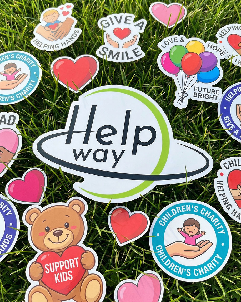
The sticker pack was designed as a tool for viral communication. We traded formalism for bold, saturated colors and clear messages: "Support Kids," "Give a Smile," "Future Bright." The variety of shapes and themes allows everyone to find their own way to express support. These stickers don't just decorate laptops or notebooks; they make charity a part of an everyday lifestyle, turning every owner into an ambassador for a good cause.
We developed a modern website for the Helpway charity fund, serving as a digital embodiment of its mission. The main goal was to create an open and straightforward resource that helps the fund build reliable relationships with partners across Germany and Europe.
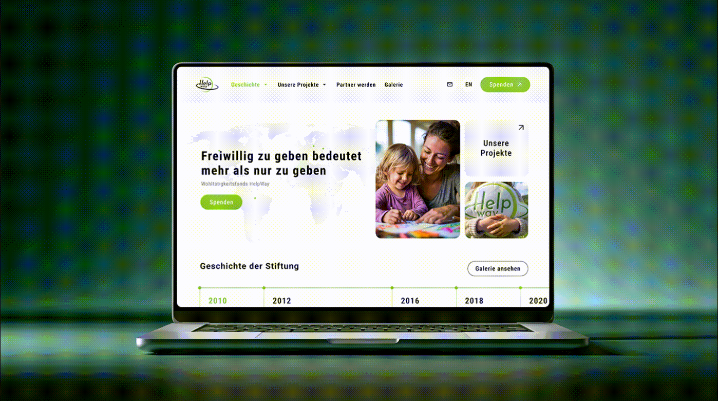
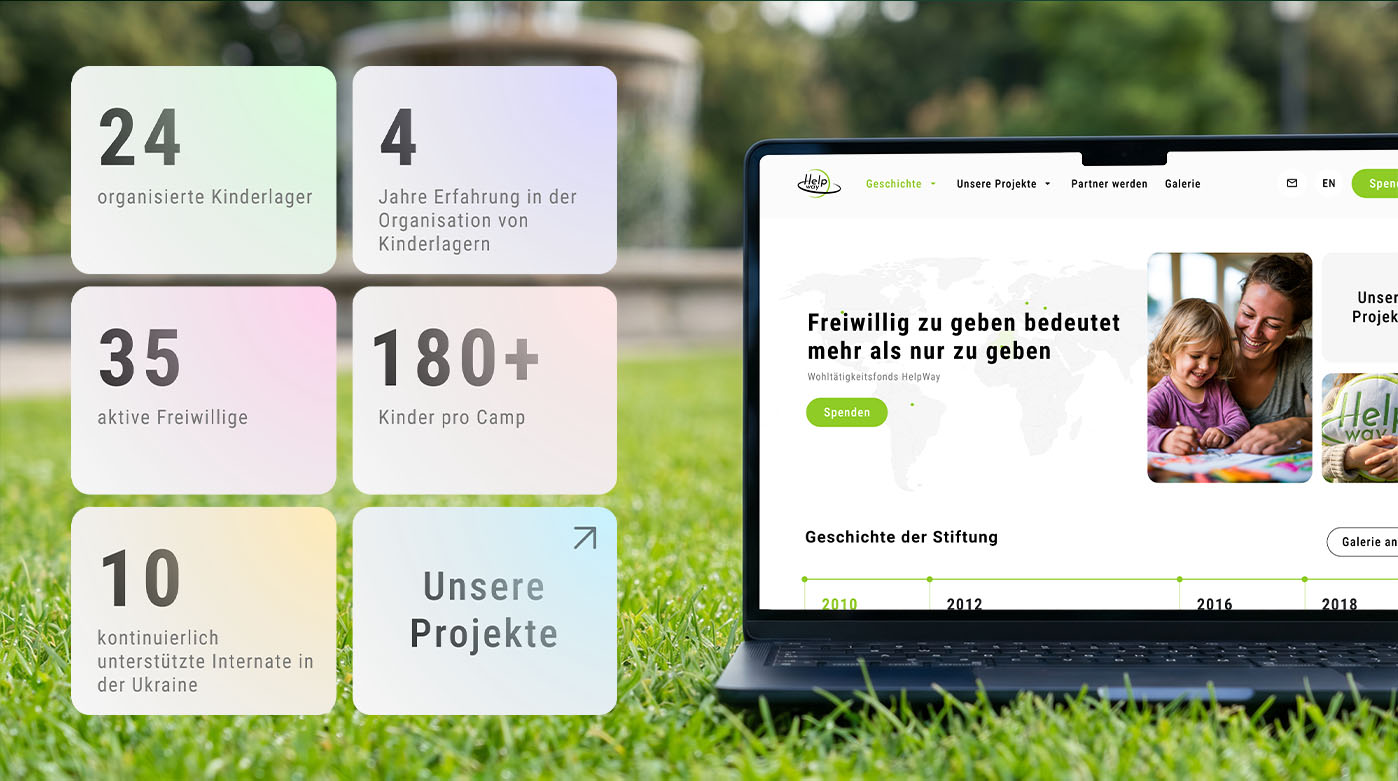
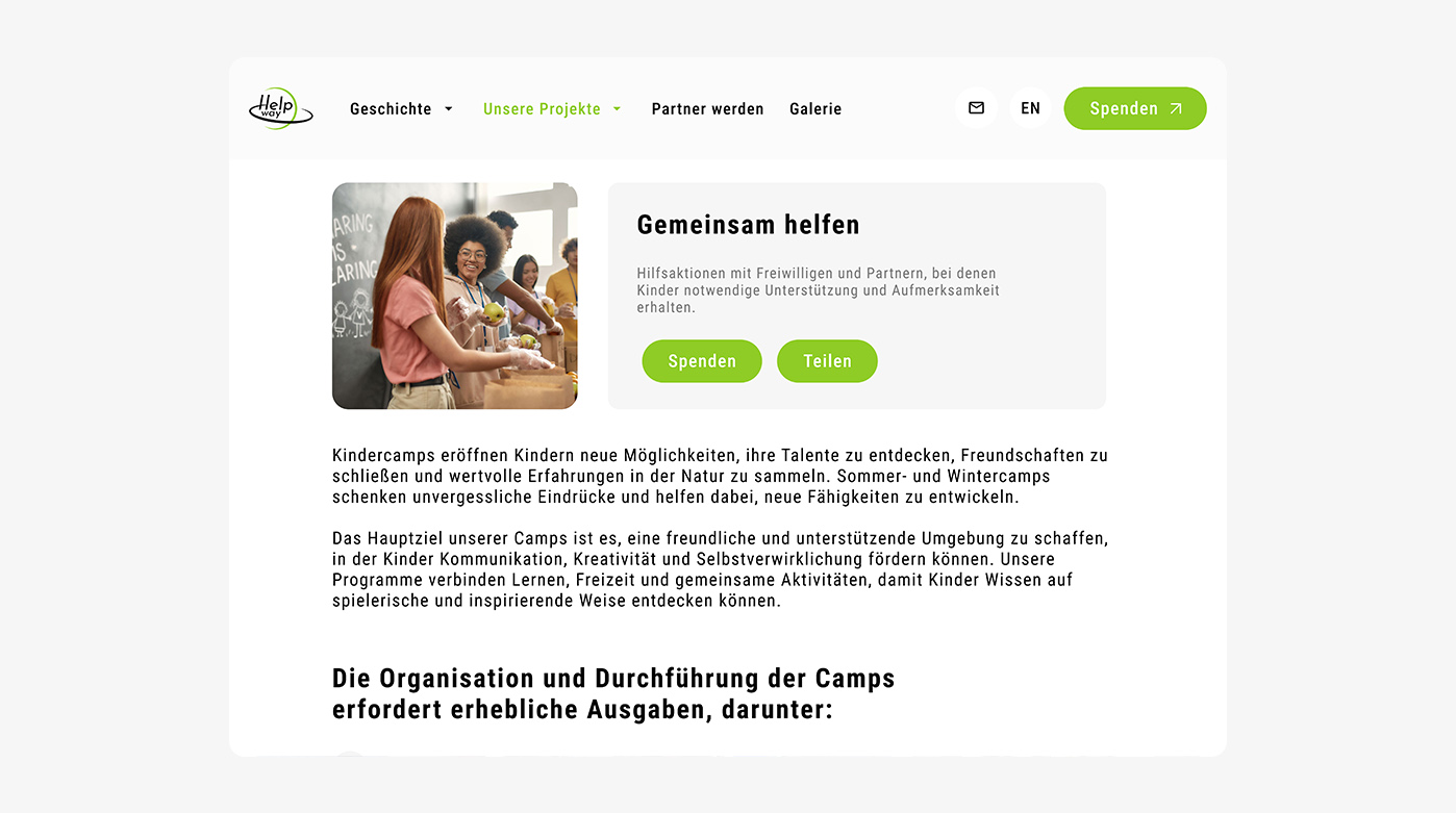
The project's visual language is built on clarity and an accent green color, chosen to symbolize growth and positive change. The light color palette adds a sense of lightness to the interface, allowing partners to focus on what matters most the concrete results of the fund's work. We used ample white space and a clean grid to ensure the site's structure is intuitive from the very first seconds on the page.
We opted out of complex visual effects in favor of sincerity and professional content presentation. High-quality photos of real projects are paired with soft graphics and modern typography, making the platform easy to navigate and pleasant to view. Every block on the homepage is designed to showcase Helpway as a professional and transparent organization. As a result, the fund received a professional digital showcase that helps attract new resources to support humanitarian initiatives.
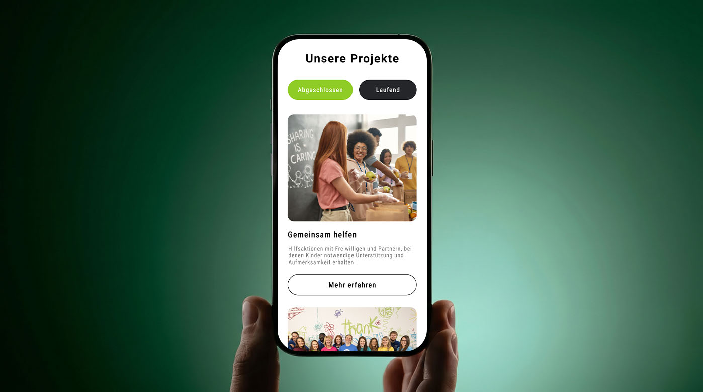
We developed an extensive structure of internal pages, transforming the website into an effective ecosystem for partner engagement. The primary focus is on interactivity and smooth submission forms, ensuring that any interested organization can quickly find ways to connect with the Helpway fund.
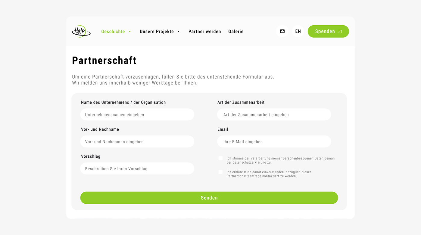
The core element for attracting new support is the well-thought-out partnership page. We designed a concise and intuitive online form where potential partners can submit their contact details, company names, and collaboration proposals in just a few clicks. This approach significantly lowers the barrier for initial contact and enables the fund’s team to promptly process incoming requests, which are automatically organized through the backend content management system.
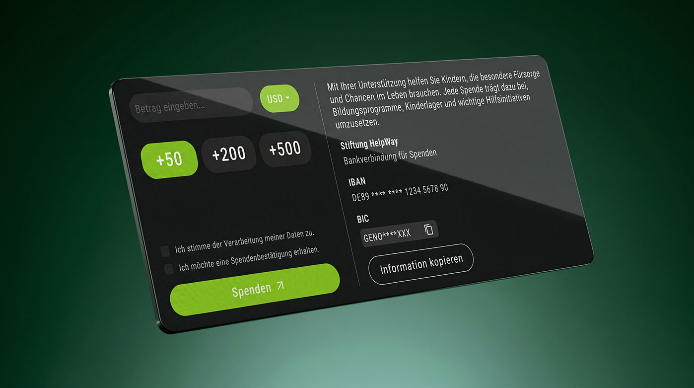
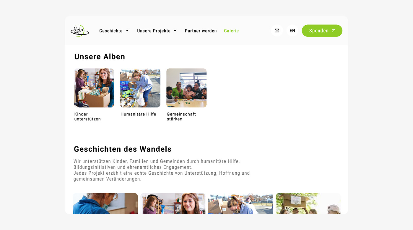
To showcase the real-world impact of the fund's work, we designed a gallery page structured into dedicated photo albums. This allows reports to be organized by specific areas of activity, such as humanitarian aid or child support. Furthermore, individual project pages feature comprehensive program descriptions and an integrated donation system, allowing users to easily choose between a quick one-time contribution or a recurring monthly subscription to support the fund's initiatives long-term.